
Menu responsive dropdown là một loại menu website được thiết kế để tự động điều chỉnh và hiển thị tối ưu trên các thiết bị có kích thước màn hình khác nhau, đặc biệt là trên điện thoại di động và máy tính bảng.
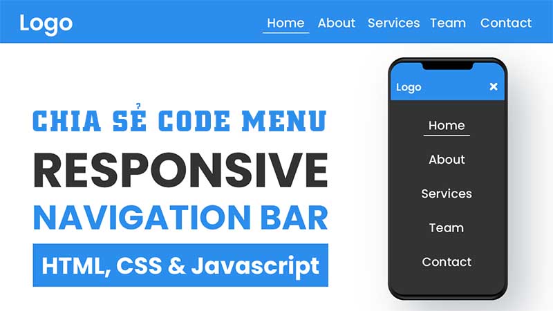
Chia sẻ code menu responsive dropdown cực đẹp
Đặc điểm chính của menu responsive dropdown:
- Tính đáp ứng (Responsive): Menu tự động thay đổi cách hiển thị để phù hợp với kích thước màn hình. Trên màn hình lớn, menu thường hiển thị ngang, trong khi trên màn hình nhỏ, nó thường chuyển thành dạng nút “hamburger” (ba gạch ngang) khi nhấn vào sẽ hiển thị danh sách các tùy chọn.
- Dropdown (Thả xuống): Các mục menu con được ẩn dưới dạng danh sách thả xuống, chỉ hiển thị khi người dùng tương tác (nhấn chuột hoặc chạm vào). Điều này giúp tiết kiệm không gian và làm cho menu gọn gàng hơn, đặc biệt trên các thiết bị có màn hình nhỏ.
Mẫu 1 menu responsive dropdown
Menu responsive dropdown này sử dụng HTML CSS & JavaScript

<!DOCTYPE html>
   <html lang="en">
   <head>
      <meta charset="UTF-8">
      <meta name="viewport" content="width=device-width, initial-scale=1.0">

      <!--=============== REMIXICONS ===============-->
      <link href="https://cdn.jsdelivr.net/npm/remixicon@3.2.0/fonts/remixicon.css" rel="stylesheet">

      <!--=============== CSS ===============-->
      <link rel="stylesheet" href="assets/css/styles.css">

      <title>Responsive dropdown menu - Bedimcode</title>
   </head>
   <body>
      <!--=============== HEADER ===============-->
      <header class="header">
         <nav class="nav container">
            <div class="nav__data">
               <a href="#" class="nav__logo">
                  <i class="ri-planet-line"></i> Company
               </a>

               <div class="nav__toggle" id="nav-toggle">
                  <i class="ri-menu-line nav__burger"></i>
                  <i class="ri-close-line nav__close"></i>
               </div>
            </div>

            <!--=============== NAV MENU ===============-->
            <div class="nav__menu" id="nav-menu">
               <ul class="nav__list">
                  <li><a href="#" class="nav__link">Home</a></li>

                  <li><a href="#" class="nav__link">Company</a></li>

                  <!--=============== DROPDOWN 1 ===============-->
                  <li class="dropdown__item">
                     <div class="nav__link">
                        Analytics <i class="ri-arrow-down-s-line dropdown__arrow"></i>
                     </div>

                     <ul class="dropdown__menu">
                        <li>
                           <a href="#" class="dropdown__link">
                              <i class="ri-pie-chart-line"></i> Overview
                           </a>
                        </li>

                        <li>
                           <a href="#" class="dropdown__link">
                              <i class="ri-arrow-up-down-line"></i> Transactions
                           </a>
                        </li>

                        <!--=============== DROPDOWN SUBMENU ===============-->
                        <li class="dropdown__subitem">
                           <div class="dropdown__link">
                              <i class="ri-bar-chart-line"></i> Reports <i class="ri-add-line dropdown__add"></i>
                           </div>

                           <ul class="dropdown__submenu">
                              <li>
                                 <a href="#" class="dropdown__sublink">
                                    <i class="ri-file-list-line"></i> Documents
                                 </a>
                              </li>

                              <li>
                                 <a href="#" class="dropdown__sublink">
                                    <i class="ri-cash-line"></i> Payments
                                 </a>
                              </li>

                              <li>
                                 <a href="#" class="dropdown__sublink">
                                    <i class="ri-refund-2-line"></i> Refunds
                                 </a>
                              </li>
                           </ul>
                        </li>
                     </ul>
                  </li>

                  <li><a href="#" class="nav__link">Products</a></li>

                  <!--=============== DROPDOWN 2 ===============-->
                  <li class="dropdown__item">
                     <div class="nav__link">
                        Users <i class="ri-arrow-down-s-line dropdown__arrow"></i>
                     </div>

                     <ul class="dropdown__menu">
                        <li>
                           <a href="#" class="dropdown__link">
                              <i class="ri-user-line"></i> Profiles
                           </a>
                        </li>

                        <li>
                           <a href="#" class="dropdown__link">
                              <i class="ri-lock-line"></i> Accounts
                           </a>
                        </li>

                        <li>
                           <a href="#" class="dropdown__link">
                              <i class="ri-message-3-line"></i> Messages
                           </a>
                        </li>
                     </ul>
                  </li>

                  <li><a href="#" class="nav__link">Contact</a></li>
               </ul>
            </div>
         </nav>
      </header>
   </body>
</html>
/*=============== GOOGLE FONTS ===============*/
@import url("https://fonts.googleapis.com/css2?family=Montserrat:wght@400;600&display=swap");
/*=============== VARIABLES CSS ===============*/
:root {
--header-height: 3.5rem;
/*========== Colors ==========*/
/*Color mode HSL(hue, saturation, lightness)*/
--black-color: hsl(220, 24%, 12%);
--black-color-light: hsl(220, 24%, 15%);
--black-color-lighten: hsl(220, 20%, 18%);
--white-color: #fff;
--body-color: hsl(220, 100%, 97%);
/*========== Font and typography ==========*/
/*.5rem = 8px | 1rem = 16px ...*/
--body-font: "Montserrat", sans-serif;
--normal-font-size: .938rem;
/*========== Font weight ==========*/
--font-regular: 400;
--font-semi-bold: 600;
/*========== z index ==========*/
--z-tooltip: 10;
--z-fixed: 100;
}
/*========== Responsive typography ==========*/
@media screen and (min-width: 1024px) {
:root {
--normal-font-size: 1rem;
}
}
/*=============== BASE ===============*/
* {
box-sizing: border-box;
padding: 0;
margin: 0;
}
body {
font-family: var(--body-font);
font-size: var(--normal-font-size);
background-color: var(--body-color);
}
ul {
list-style: none;
/* Color highlighting when pressed on mobile devices */
/*-webkit-tap-highlight-color: transparent;*/
}
a {
text-decoration: none;
}
/*=============== REUSABLE CSS CLASSES ===============*/
.container {
max-width: 1120px;
margin-inline: 1.5rem;
}
/*=============== HEADER ===============*/
.header {
position: fixed;
top: 0;
left: 0;
width: 100%;
background-color: var(--black-color);
box-shadow: 0 2px 16px hsla(220, 32%, 8%, .3);
z-index: var(--z-fixed);
}
/*=============== NAV ===============*/
.nav {
height: var(--header-height);
}
.nav__logo,
.nav__burger,
.nav__close {
color: var(--white-color);
}
.nav__data {
height: 100%;
display: flex;
justify-content: space-between;
align-items: center;
}
.nav__logo {
display: inline-flex;
align-items: center;
column-gap: .25rem;
font-weight: var(--font-semi-bold);
/* Color highlighting when pressed on mobile devices */
/*-webkit-tap-highlight-color: transparent;*/
}
.nav__logo i {
font-weight: initial;
font-size: 1.25rem;
}
.nav__toggle {
position: relative;
width: 32px;
height: 32px;
}
.nav__burger,
.nav__close {
position: absolute;
width: max-content;
height: max-content;
inset: 0;
margin: auto;
font-size: 1.25rem;
cursor: pointer;
transition: opacity .1s, transform .4s;
}
.nav__close {
opacity: 0;
}
/* Navigation for mobile devices */
@media screen and (max-width: 1118px) {
.nav__menu {
position: absolute;
left: 0;
top: 2.5rem;
width: 100%;
height: calc(100vh - 3.5rem);
overflow: auto;
pointer-events: none;
opacity: 0;
transition: top .4s, opacity .3s;
}
.nav__menu::-webkit-scrollbar {
width: 0;
}
.nav__list {
background-color: var(--black-color);
padding-top: 1rem;
}
}
.nav__link {
color: var(--white-color);
background-color: var(--black-color);
font-weight: var(--font-semi-bold);
padding: 1.25rem 1.5rem;
display: flex;
justify-content: space-between;
align-items: center;
transition: background-color .3s;
}
.nav__link:hover {
background-color: var(--black-color-light);
}
/* Show menu */
.show-menu {
opacity: 1;
top: 3.5rem;
pointer-events: initial;
}
/* Show icon */
.show-icon .nav__burger {
opacity: 0;
transform: rotate(90deg);
}
.show-icon .nav__close {
opacity: 1;
transform: rotate(90deg);
}
/*=============== DROPDOWN ===============*/
.dropdown__item {
cursor: pointer;
}
.dropdown__arrow {
font-size: 1.25rem;
font-weight: initial;
transition: transform .4s;
}
.dropdown__link,
.dropdown__sublink {
padding: 1.25rem 1.25rem 1.25rem 2.5rem;
color: var(--white-color);
background-color: var(--black-color-light);
display: flex;
align-items: center;
column-gap: .5rem;
font-weight: var(--font-semi-bold);
transition: background-color .3s;
}
.dropdown__link i,
.dropdown__sublink i {
font-size: 1.25rem;
font-weight: initial;
}
.dropdown__link:hover,
.dropdown__sublink:hover {
background-color: var(--black-color);
}
.dropdown__menu,
.dropdown__submenu {
max-height: 0;
overflow: hidden;
transition: max-height .4s ease-out;
}
/* Show dropdown menu & submenu */
.dropdown__item:hover .dropdown__menu,
.dropdown__subitem:hover > .dropdown__submenu {
max-height: 1000px;
transition: max-height .4s ease-in;
}
/* Rotate dropdown icon */
.dropdown__item:hover .dropdown__arrow {
transform: rotate(180deg);
}
/*=============== DROPDOWN SUBMENU ===============*/
.dropdown__add {
margin-left: auto;
}
.dropdown__sublink {
background-color: var(--black-color-lighten);
}
/*=============== BREAKPOINTS ===============*/
/* For small devices */
@media screen and (max-width: 340px) {
.container {
margin-inline: 1rem;
}
.nav__link {
padding-inline: 1rem;
}
}
/* For large devices */
@media screen and (min-width: 1118px) {
.container {
margin-inline: auto;
}
.nav {
height: calc(var(--header-height) + 2rem);
display: flex;
justify-content: space-between;
}
.nav__toggle {
display: none;
}
.nav__list {
height: 100%;
display: flex;
column-gap: 3rem;
}
.nav__link {
height: 100%;
padding: 0;
justify-content: initial;
column-gap: .25rem;
}
.nav__link:hover {
background-color: transparent;
}
.dropdown__item,
.dropdown__subitem {
position: relative;
}
.dropdown__menu,
.dropdown__submenu {
max-height: initial;
overflow: initial;
position: absolute;
left: 0;
top: 6rem;
opacity: 0;
pointer-events: none;
transition: opacity .3s, top .3s;
}
.dropdown__link,
.dropdown__sublink {
padding-inline: 1rem 3.5rem;
}
.dropdown__subitem .dropdown__link {
padding-inline: 1rem;
}
.dropdown__submenu {
position: absolute;
left: 100%;
top: .5rem;
}
/* Show dropdown menu */
.dropdown__item:hover .dropdown__menu {
opacity: 1;
top: 5.5rem;
pointer-events: initial;
transition: top .3s;
}
/* Show dropdown submenu */
.dropdown__subitem:hover > .dropdown__submenu {
opacity: 1;
top: 0;
pointer-events: initial;
transition: top .3s;
}
}/*=============== SHOW MENU ===============*/
const showMenu = (toggleId, navId) =>{
const toggle = document.getElementById(toggleId),
nav = document.getElementById(navId)
toggle.addEventListener('click', () =>{
// Add show-menu class to nav menu
nav.classList.toggle('show-menu')
// Add show-icon to show and hide the menu icon
toggle.classList.toggle('show-icon')
})
}
showMenu('nav-toggle','nav-menu')Mẫu 2 menu responsive dropdown
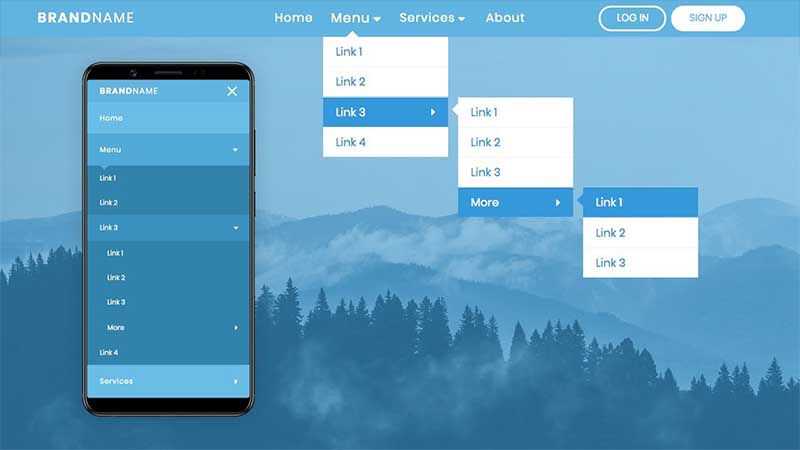
Menu responsive dropdown này chỉ sử dụng html và css. Chúng ta cũng sẽ học cách tạo menu hamburger hoạt hình trên màn hình nhỏ. Ngoài ra, chúng ta sẽ tạo một số hoạt ảnh thú vị mà tôi quyết định thêm vào để làm cho menu của chúng ta tuyệt vời hơn.
<!DOCTYPE html>
<html lang="en">
<head>
<meta charset="UTF-8">
<meta name="viewport" content="width=device-width, initial-scale=1.0">
<meta http-equiv="X-UA-Compatible" content="ie=edge">
<link rel="stylesheet" href="https://cdnjs.cloudflare.com/ajax/libs/font-awesome/6.7.2/css/all.min.css" integrity="sha512-Evv84Mr4kqVGRNSgIGL/F/aIDqQb7xQ2vcrdIwxfjThSH8CSR7PBEakCr51Ck+w+/U6swU2Im1vVX0SVk9ABhg==" crossorigin="anonymous" referrerpolicy="no-referrer" />
<link rel="stylesheet" href="style.css">
<title>Responsive Navbar</title>
</head>
<body>
<header>
<div class="container">
<input type="checkbox" name="" id="check">
<div class="logo-container">
<h3 class="logo">Brand<span>Name</span></h3>
</div>
<div class="nav-btn">
<div class="nav-links">
<ul>
<li class="nav-link" style="--i: .6s">
<a href="#">Home</a>
</li>
<li class="nav-link" style="--i: .85s">
<a href="#">Menu<i class="fas fa-caret-down"></i></a>
<div class="dropdown">
<ul>
<li class="dropdown-link">
<a href="#">Link 1</a>
</li>
<li class="dropdown-link">
<a href="#">Link 2</a>
</li>
<li class="dropdown-link">
<a href="#">Link 3<i class="fas fa-caret-down"></i></a>
<div class="dropdown second">
<ul>
<li class="dropdown-link">
<a href="#">Link 1</a>
</li>
<li class="dropdown-link">
<a href="#">Link 2</a>
</li>
<li class="dropdown-link">
<a href="#">Link 3</a>
</li>
<li class="dropdown-link">
<a href="#">More<i class="fas fa-caret-down"></i></a>
<div class="dropdown second">
<ul>
<li class="dropdown-link">
<a href="#">Link 1</a>
</li>
<li class="dropdown-link">
<a href="#">Link 2</a>
</li>
<li class="dropdown-link">
<a href="#">Link 3</a>
</li>
<div class="arrow"></div>
</ul>
</div>
</li>
<div class="arrow"></div>
</ul>
</div>
</li>
<li class="dropdown-link">
<a href="#">Link 4</a>
</li>
<div class="arrow"></div>
</ul>
</div>
</li>
<li class="nav-link" style="--i: 1.1s">
<a href="#">Services<i class="fas fa-caret-down"></i></a>
<div class="dropdown">
<ul>
<li class="dropdown-link">
<a href="#">Link 1</a>
</li>
<li class="dropdown-link">
<a href="#">Link 2</a>
</li>
<li class="dropdown-link">
<a href="#">Link 3<i class="fas fa-caret-down"></i></a>
<div class="dropdown second">
<ul>
<li class="dropdown-link">
<a href="#">Link 1</a>
</li>
<li class="dropdown-link">
<a href="#">Link 2</a>
</li>
<li class="dropdown-link">
<a href="#">Link 3</a>
</li>
<li class="dropdown-link">
<a href="#">More<i class="fas fa-caret-down"></i></a>
<div class="dropdown second">
<ul>
<li class="dropdown-link">
<a href="#">Link 1</a>
</li>
<li class="dropdown-link">
<a href="#">Link 2</a>
</li>
<li class="dropdown-link">
<a href="#">Link 3</a>
</li>
<div class="arrow"></div>
</ul>
</div>
</li>
<div class="arrow"></div>
</ul>
</div>
</li>
<li class="dropdown-link">
<a href="#">Link 4</a>
</li>
<div class="arrow"></div>
</ul>
</div>
</li>
<li class="nav-link" style="--i: 1.35s">
<a href="#">About</a>
</li>
</ul>
</div>
<div class="log-sign" style="--i: 1.8s">
<a href="#" class="btn transparent">Log in</a>
<a href="#" class="btn solid">Sign up</a>
</div>
</div>
<div class="hamburger-menu-container">
<div class="hamburger-menu">
<div></div>
</div>
</div>
</div>
</header>
<main>
<section>
<div class="overlay"></div>
</section>
</main>
</body>
</html>@import url('https://fonts.googleapis.com/css2?family=Poppins:wght@100;200;300;400;500;600;700;800;900&display=swap');
*{
padding: 0;
margin: 0;
box-sizing: border-box;
}
body{
font-family: 'Poppins', sans-serif;
overflow: hidden;
}
ul{
list-style: none;
}
a{
text-decoration: none;
}
header{
position: sticky;
top: 0px;
background-color: #60b4df;
width: 100%;
z-index: 1000;
}
section{
position: relative;
height: calc(100vh - 3rem);
width: 100%;
background: url('bg.jpg') no-repeat top center / cover;
overflow: hidden;
}
.overlay{
position: absolute;
width: 100%;
height: 100%;
top: 0;
left: 0;
background-color: rgb(56, 165, 238, 0.5);
}
.container{
max-width: 65rem;
padding: 0 2rem;
margin: 0 auto;
display: flex;
position: relative;
}
.logo-container{
flex: 1;
display: flex;
align-items: center;
}
.nav-btn{
flex: 3;
display: flex;
}
.nav-links{
flex: 2;
}
.log-sign{
display: flex;
justify-content: center;
align-items: center;
flex: 1;
}
.logo{
color: #fff;
font-size: 1.1rem;
font-weight: 600;
letter-spacing: 2px;
text-transform: uppercase;
line-height: 3rem;
}
.logo span{
font-weight: 300;
}
.btn{
display: inline-block;
padding: .5rem 1.3rem;
font-size: .8rem;
border: 2px solid #fff;
border-radius: 2rem;
line-height: 1;
margin: 0 .2rem;
transition: .3s;
text-transform: uppercase;
}
.btn.solid, .btn.transparent:hover{
background-color: #fff;
color: #69bde7;
}
.btn.transparent, .btn.solid:hover{
background-color: transparent;
color: #fff;
}
.nav-links > ul{
display: flex;
justify-content: center;
align-items: center;
}
.nav-link{
position: relative;
}
.nav-link > a{
line-height: 3rem;
color: #fff;
padding: 0 .8rem;
letter-spacing: 1px;
font-size: .95rem;
display: flex;
align-items: center;
justify-content: space-between;
transition: .5s;
}
.nav-link > a > i{
margin-left: .2rem;
}
.nav-link:hover > a{
transform: scale(1.1);
}
.dropdown{
position: absolute;
top: 100%;
left: 0;
width: 10rem;
transform: translateY(10px);
opacity: 0;
pointer-events: none;
transition: .5s;
}
.dropdown ul{
position: relative;
}
.dropdown-link > a{
display: flex;
background-color: #fff;
color: #3498db;
padding: .5rem 1rem;
font-size: .9rem;
align-items: center;
justify-content: space-between;
transition: .3s;
}
.dropdown-link:hover > a{
background-color: #3498db;
color: #fff;
}
.dropdown-link:not(:nth-last-child(2)){
border-bottom: 1px solid #efefef;
}
.dropdown-link i{
transform: rotate(-90deg);
}
.arrow{
position: absolute;
width: 11px;
height: 11px;
top: -5.5px;
left: 32px;
background-color: #fff;
transform: rotate(45deg);
cursor: pointer;
transition: .3s;
z-index: -1;
}
.dropdown-link:first-child:hover ~ .arrow{
background-color: #3498db;
}
.dropdown-link{
position: relative;
}
.dropdown.second{
top: 0;
left: 100%;
padding-left: .8rem;
cursor: pointer;
transform: translateX(10px);
}
.dropdown.second .arrow{
top: 10px;
left: -5.5px;
}
.nav-link:hover > .dropdown,
.dropdown-link:hover > .dropdown{
transform: translate(0, 0);
opacity: 1;
pointer-events: auto;
}
.hamburger-menu-container{
flex: 1;
display: none;
align-items: center;
justify-content: flex-end;
}
.hamburger-menu{
width: 2.5rem;
height: 2.5rem;
display: flex;
align-items: center;
justify-content: flex-end;
}
.hamburger-menu div{
width: 1.6rem;
height: 3px;
border-radius: 3px;
background-color: #fff;
position: relative;
z-index: 1001;
transition: .5s;
}
.hamburger-menu div:before,
.hamburger-menu div:after{
content: '';
position: absolute;
width: inherit;
height: inherit;
background-color: #fff;
border-radius: 3px;
transition: .5s;
}
.hamburger-menu div:before{
transform: translateY(-7px);
}
.hamburger-menu div:after{
transform: translateY(7px);
}
#check{
position: absolute;
top: 50%;
right: 1.5rem;
transform: translateY(-50%);
width: 2.5rem;
height: 2.5rem;
z-index: 90000;
cursor: pointer;
opacity: 0;
display: none;
}
#check:checked ~ .hamburger-menu-container .hamburger-menu div{
background-color: transparent;
}
#check:checked ~ .hamburger-menu-container .hamburger-menu div:before{
transform: translateY(0) rotate(-45deg);
}
#check:checked ~ .hamburger-menu-container .hamburger-menu div:after{
transform: translateY(0) rotate(45deg);
}
@keyframes animation{
from{
opacity: 0;
transform: translateY(15px);
}
to{
opacity: 1;
transform: translateY(0px);
}
}
@media (max-width: 920px){
.hamburger-menu-container{
display: flex;
}
#check{
display: block;
}
.nav-btn{
position: fixed;
height: calc(100vh - 3rem);
top: 3rem;
left: 0;
width: 100%;
background-color: #69bde7;
flex-direction: column;
align-items: center;
justify-content: space-between;
overflow-x: hidden;
overflow-y: auto;
transform: translateX(100%);
transition: .65s;
}
#check:checked ~ .nav-btn{
transform: translateX(0);
}
#check:checked ~ .nav-btn .nav-link,
#check:checked ~ .nav-btn .log-sign{
animation: animation .5s ease forwards var(--i);
}
.nav-links{
flex: initial;
width: 100%;
}
.nav-links > ul{
flex-direction: column;
}
.nav-link{
width: 100%;
opacity: 0;
transform: translateY(15px);
}
.nav-link > a{
line-height: 1;
padding: 1.6rem 2rem;
}
.nav-link:hover > a{
transform: scale(1);
background-color: #50a9d6;
}
.dropdown, .dropdown.second{
position: initial;
top: initial;
left: initial;
transform: initial;
opacity: 1;
pointer-events: auto;
width: 100%;
padding: 0;
background-color: #3183ac;
display: none;
}
.nav-link:hover > .dropdown,
.dropdown-link:hover > .dropdown{
display: block;
}
.nav-link:hover > a > i,
.dropdown-link:hover > a > i{
transform: rotate(360deg);
}
.dropdown-link > a{
background-color: transparent;
color: #fff;
padding: 1.2rem 2rem;
line-height: 1;
}
.dropdown.second .dropdown-link > a{
padding: 1.2rem 2rem 1.2rem 3rem;
}
.dropdown.second .dropdown.second .dropdown-link > a{
padding: 1.2rem 2rem 1.2rem 4rem;
}
.dropdown-link:not(:nth-last-child(2)){
border-bottom: none;
}
.arrow{
z-index: 1;
background-color: #69bde7;
left: 10%;
transform: scale(1.1) rotate(45deg);
transition: .5s;
}
.nav-link:hover .arrow{
background-color: #50a9d6;
}
.dropdown .dropdown .arrow{
display: none;
}
.dropdown-link:hover > a{
background-color: #3a91bd;
}
.dropdown-link:first-child:hover ~ .arrow{
background-color: #50a9d6;
}
.nav-link > a > i{
font-size: 1.1rem;
transform: rotate(-90deg);
transition: .7s;
}
.dropdown i{
font-size: 1rem;
transition: .7s;
}
.log-sign{
flex: initial;
width: 100%;
padding: 1.5rem 1.9rem;
justify-content: flex-start;
opacity: 0;
transform: translateY(15px);
}
}Mẫu 3 mega menu responsive dropdown
Mega menu responsive dropdown là một phiên bản nâng cao của menu dropdown thông thường, được thiết kế để hiển thị một lượng lớn nội dung một cách trực quan và dễ dàng truy cập, đồng thời vẫn đảm bảo tính đáp ứng trên các thiết bị khác nhau.

<link rel="stylesheet" href="https://cdnjs.cloudflare.com/ajax/libs/font-awesome/6.7.2/css/all.min.css" integrity="sha512-Evv84Mr4kqVGRNSgIGL/F/aIDqQb7xQ2vcrdIwxfjThSH8CSR7PBEakCr51Ck+w+/U6swU2Im1vVX0SVk9ABhg==" crossorigin="anonymous" referrerpolicy="no-referrer" />

<header class="header">
        <div class="header-row container" role="navigation" aria-label="Main">
            <div class="header-left">
                <div class="logo">
                    <h1>logo</h1>
                </div>
            </div>
            <div class="header-right">
                <ul class="main-menu">
                    <li class="menu-item"><a href="#" class="active">Home</a></li>

                    <li class="menu-item mega-menu">
                        <a href="#">Mega menu +</a>
                        <div class="mega-menu-wrapper slideInUp">
                            <div class="mega-menu-col">
                                <h5>Menu block 1</h5>
                                <ul class="mega-sub-menu">
                                    <li><a href="#">Menu block item 1</a></li>
                                    <li><a href="#">Menu block item 2</a></li>
                                    <li><a href="#">Menu block item 3</a></li>
                                    <li><a href="#">Menu block item 4</a></li>
                                    <li><a href="#">Menu block item 5</a></li>
                                </ul>
                            </div>
                            <div class="mega-menu-col">
                                <h5>Menu block 2</h5>
                                <ul class="mega-sub-menu">
                                    <li><a href="#">Menu block item 1</a></li>
                                    <li><a href="#">Menu block item 2</a></li>
                                    <li><a href="#">Menu block item 3</a></li>
                                    <li><a href="#">Menu block item 4</a></li>
                                    <li><a href="#">Menu block item 5</a></li>
                                </ul>
                            </div>
                            <div class="mega-menu-col">
                                <h5>Menu block 3</h5>
                                <ul class="mega-sub-menu">
                                    <li><a href="#">Menu block item 1</a></li>
                                    <li><a href="#">Menu block item 2</a></li>
                                    <li><a href="#">Menu block item 3</a></li>
                                    <li><a href="#">Menu block item 4</a></li>
                                    <li><a href="#">Menu block item 5</a></li>
                                </ul>
                            </div>
                            <div class="mega-menu-col">
                                <h5>Menu block 4</h5>
                                <ul class="mega-sub-menu">
                                    <li><a href="#">Menu block item 1</a></li>
                                    <li><a href="#">Menu block item 2</a></li>
                                    <li><a href="#">Menu block item 3</a></li>
                                    <li><a href="#">Menu block item 4</a></li>
                                    <li><a href="#">Menu block item 5</a></li>
                                </ul>
                            </div>
                        </div>
                    </li>

                    <li class="menu-item dropdown">
                        <a href="#">Services +</a>
                        <div class="sub-menu-wrapper slideInUp">
                            <ul class="sub-menu">
                                <li class="menu-item"><a href="#">Service 1</a></li>
                                <li class="menu-item"><a href="#">Service 2</a></li>
                                <li class="menu-item"><a href="#">Service 3</a></li>
                                <li class="menu-item"><a href="#">Service 4</a></li>
                            </ul>
                        </div>
                    </li>
                    <li class="menu-item"><a href="#">Blog</a></li>
                    <li class="menu-item"><a href="#">Contact</a></li>
                </ul>
                <a href="#" id="hamburger-icon" class="mobile-toggler" aria-label="Mobile Menu"><i class="fas fa-bars"></i></a>
            </div>

            <!-- Mobile menu -->
            <div id="mobile-menu" class="mobile-menu hidden slideInDown">
                <ul>
                    <li class="menu-item"><a href="#" class="active">Home</a></li>

                    <li class="menu-item mega-menu">
                        <a href="#">Mega menu +</a>
                        <div class="mega-menu-wrapper">
                            <div class="mega-menu-col">
                                <h5>Menu block 1</h5>
                                <ul class="mega-sub-menu">
                                    <li><a href="#">Menu block item 1</a></li>
                                    <li><a href="#">Menu block item 2</a></li>
                                    <li><a href="#">Menu block item 3</a></li>
                                    <li><a href="#">Menu block item 4</a></li>
                                    <li><a href="#">Menu block item 5</a></li>
                                </ul>
                            </div>
                            <div class="mega-menu-col">
                                <h5>Menu block 2</h5>
                                <ul class="mega-sub-menu">
                                    <li><a href="#">Menu block item 1</a></li>
                                    <li><a href="#">Menu block item 2</a></li>
                                    <li><a href="#">Menu block item 3</a></li>
                                    <li><a href="#">Menu block item 4</a></li>
                                    <li><a href="#">Menu block item 5</a></li>
                                </ul>
                            </div>
                            <div class="mega-menu-col">
                                <h5>Menu block 3</h5>
                                <ul class="mega-sub-menu">
                                    <li><a href="#">Menu block item 1</a></li>
                                    <li><a href="#">Menu block item 2</a></li>
                                    <li><a href="#">Menu block item 3</a></li>
                                    <li><a href="#">Menu block item 4</a></li>
                                    <li><a href="#">Menu block item 5</a></li>
                                </ul>
                            </div>
                            <div class="mega-menu-col">
                                <h5>Menu block 4</h5>
                                <ul class="mega-sub-menu">
                                    <li><a href="#">Menu block item 1</a></li>
                                    <li><a href="#">Menu block item 2</a></li>
                                    <li><a href="#">Menu block item 3</a></li>
                                    <li><a href="#">Menu block item 4</a></li>
                                    <li><a href="#">Menu block item 5</a></li>
                                </ul>
                            </div>
                        </div>
                    </li>

                    <li class="menu-item dropdown">
                        <a href="#">Services +</a>
                        <div class="sub-menu-wrapper">
                            <ul class="sub-menu">
                                <li class="menu-item"><a href="#">Service 1</a></li>
                                <li class="menu-item"><a href="#">Service 2</a></li>
                                <li class="menu-item"><a href="#">Service 3</a></li>
                                <li class="menu-item"><a href="#">Service 4</a></li>
                            </ul>
                        </div>
                    </li>
                    <li class="menu-item"><a href="#">Blog</a></li>
                    <li class="menu-item"><a href="#">Contact</a></li>
                </ul>
            </div>
        </div>
    </header>

    <section class="hero">
        <div class="container">
            <h1>Awesome Mega Menu</h1>
        </div>
    </section>
*, *::before, *::after {
box-sizing: border-box;
margin: 0;
padding: 0;
}
body {
font-family: Arial, Helvetica, sans-serif;
}
.header {
border-bottom: 3px solid #ededed;
background-color: #ffffff;
min-height: 68px;
display: flex;
}
.hidden {
display: none;
}
.slideInDown {
-webkit-animation-name: slideInDown;
animation-name: slideInDown;
-webkit-animation-duration: .4s;
animation-duration: .4s;
-webkit-animation-fill-mode: both;
animation-fill-mode: both;
}
@-webkit-keyframes slideInDown {
0% {
-webkit-transform: translateY(-100%);
transform: translateY(-100%);
visibility: visible;
}
100% {
-webkit-transform: translateY(0);
transform: translateY(0);
}
}
@keyframes slideInDown {
0% {
-webkit-transform: translateY(-100%);
transform: translateY(-100%);
visibility: visible;
}
100% {
-webkit-transform: translateY(0);
transform: translateY(0);
}
}
.slideInUp {
-webkit-animation-name: slideInUp;
animation-name: slideInUp;
-webkit-animation-duration: .6s;
animation-duration: .6s;
-webkit-animation-fill-mode: both;
animation-fill-mode: both;
}
@-webkit-keyframes slideInUp {
0% {
-webkit-transform: translateY(15%);
transform: translateY(15%);
visibility: visible;
}
100% {
-webkit-transform: translateY(0);
transform: translateY(0);
}
}
@keyframes slideInUp {
0% {
-webkit-transform: translateY(15%);
transform: translateY(15%);
visibility: visible;
}
100% {
-webkit-transform: translateY(0);
transform: translateY(0);
}
}
.header .header-row {
display: flex;
align-items: center;
justify-content: space-between;
width: 100%;
position: relative;
}
/* Mobile menu styles */
.header .header-row .mobile-menu {
position: absolute;
background-color: #2376ad;
top: 100%;
left: 0;
width: 100%;
border-top: 3px solid #e9900a;
}
.header .header-row .mobile-menu {
background-color: #fff;
padding: 15px 20px;
box-shadow: 0 5px 8px rgb(0 0 0 / 15%);
}
.header .header-row .mobile-menu ul {
list-style: none;
}
.header .header-row .mobile-menu ul li {
margin-bottom: 10px;
}
.header .header-row .mobile-menu ul li:hover {
background-color: rgba(222, 225, 226, 0.466);
}
/* Mega menu styles */
.header .header-row .mobile-menu ul li.mega-menu {
position: relative;
}
.header .header-row .mobile-menu ul li.mega-menu .mega-menu-wrapper {
display: none;
}
.header .header-row .mobile-menu ul li a {
text-decoration: none;
display: block;
font-size: 14px;
font-weight: 600;
color: rgb(128, 131, 131);
padding-top: 8px;
padding-bottom: 8px;
padding-left: 8px;
}
.header .header-row .mobile-menu ul li.mega-menu:hover .mega-menu-wrapper {
display: grid;
grid-template-columns: 1fr 1fr;
padding: 20px;
}
.header .header-row .mobile-menu ul li.mega-menu .mega-menu-wrapper .mega-menu-col {
margin-bottom: 20px;
}
.header .header-row .mobile-menu ul li.mega-menu .mega-menu-wrapper .mega-menu-col h5 {
font-weight: 800;
text-transform: uppercase;
}
.header .header-row .mobile-menu ul li.mega-menu .mega-menu-wrapper .mega-menu-col ul li a {
font-weight: 400;
}
/* Simple drop down menu */
.header .header-row .mobile-menu ul li.dropdown {
position: relative;
}
.header .header-row .mobile-menu ul li.dropdown .sub-menu-wrapper {
display: none;
}
.header .header-row .mobile-menu ul li.dropdown .sub-menu-wrapper ul li a {
font-weight: 400;
padding-left: 15px;
}
.header .header-row .mobile-menu ul li.dropdown:hover .sub-menu-wrapper {
display: block;
}
/* Hide desktop menu on mobile up to 48em */
@media (max-width: 48em) {
.header .header-row .header-right .main-menu {
display: none;
}
}
/* Show menu on desktop 48em and above */
@media (min-width: 48em) {
.header {
border-bottom: 3px solid #ededed;
background-color: #ffffff;
}
.header .header-row {
display: flex;
flex-flow: row nowrap;
align-items: center;
justify-content: space-between;
width: 100%;
position: relative;
}
.header .mobile-toggler {
display: none;
}
.header .header-row .header-right .main-menu {
display: flex;
}
.header .header-row .header-right .main-menu li.menu-item {
display: block;
}
.header .header-row .header-right .main-menu li.dropdown {
position: relative;
}
.header .header-row .header-right .main-menu li.menu-item:not(:last-child) {
margin: 0 20px 0 0;
}
.header .header-row .header-right .main-menu li.menu-item > a {
font-size: 13px;
font-weight: 600;
line-height: 20px;
color: #444444;
padding: 40px 14px 40px 14px;
display: inline-block;
text-decoration: none;
text-transform: uppercase;
}
.header .header-row .header-right .main-menu li.menu-item a.active {
color: #e9900a;
}
.header .header-row .header-right .main-menu .sub-menu-wrapper {
position: absolute;
text-align: left;
margin: 0;
z-index: 111;
min-width: 100%;
line-height: 20px;
display: none;
}
/* Show dropdown menu on hover */
.header .header-row .header-right .main-menu > li.menu-item:hover .sub-menu-wrapper {
display: block;
}
.header .header-row .header-right .main-menu .dropdown ul.sub-menu {
background-color: #ffffff;
border-top: 3px solid #e9900a;
min-width: 200px;
padding: 0px 0;
box-shadow: 0 5px 8px rgb(0 0 0 / 15%);
text-transform: none;
}
.header .header-row .header-right .main-menu li.menu-item:hover .sub-menu-wrapper li.menu-item {
padding: 0;
margin-right: 0;
}
.header .header-row .header-right .main-menu li.menu-item:hover .sub-menu-wrapper li.menu-item > a {
padding: 8px;
display: block;
text-transform: none;
color: #6d6c6c;
font-size: 14px;
font-weight: 400;
}
.header .header-row .header-right .main-menu .sub-menu-wrapper ul li:not(:last-child) {
border-bottom: 1px solid rgba(204, 204, 204, 0.432);
}
.header .header-row .header-right .main-menu .sub-menu-wrapper ul li:hover {
background-color: #ededed;
}
/* Mega menu styles */
.header .header-row .header-right .main-menu .mega-menu .mega-menu-wrapper {
position: absolute;
left: 0px;
display: none;
padding: 20px 25px;
background-color: #ffffff;
border-top: 3px solid #e9900a;
width: 100%;
box-shadow: 0 5px 8px rgb(0 0 0 / 15%);
}
/* Show mega menu on hover */
.header .header-row .header-right .main-menu li.mega-menu:hover .mega-menu-wrapper {
display: grid;
grid-template-columns: repeat(4, 1fr);
}
.header .header-row .header-right .main-menu li.mega-menu:hover .mega-menu-wrapper .mega-menu-col h5 {
text-transform: uppercase;
margin-bottom: 15px;
padding-left: 8px;
}
.header .header-row .header-right .main-menu li.mega-menu:hover .mega-menu-wrapper .mega-menu-col ul {
list-style: none;
margin-left: 0px;
margin-right: 20px;
}
.header .header-row .header-right .main-menu li.mega-menu:hover .mega-menu-wrapper .mega-menu-col ul li a {
text-decoration: none;
padding: 8px;
display: block;
font-size: 14px;
color: rgba(149, 151, 151, 1);
}
.header .header-row .header-right .main-menu li.mega-menu:hover .mega-menu-wrapper .mega-menu-col ul li:hover a {
background-color: rgba(222, 225, 226, 0.466);
}
}
.header .mobile-toggler {
color: #ffffff;
background-color: #0088cc;
cursor: pointer;
padding: 7px 13px;
text-align: center;
font-size: 13px;
vertical-align: middle;
margin: 8px 0 8px 1em;
line-height: 20px;
}
.hero {
background: rgb(5,146,200);
background: linear-gradient(107deg, rgba(5,146,200,1) 0%, rgba(15,113,117,1) 100%);
padding: 50px 20px;
min-height: 80vh;
color: #fff;
display: flex;
text-align: center;
align-items: center;
font-size: 40px;
}
@media (min-width: 48em) {
.hero {
font-size: 60px;
}
}
/* Container styles */
.container {
margin-right: auto;
margin-left: auto;
}
@media (max-width: 36em) {
.container {
max-width: 540px;
}
}
@media (min-width: 36em) {
.container {
max-width: 540px;
}
}
@media (min-width: 48em) {
.container {
max-width: 720px;
}
}
@media (min-width: 62em) {
.container {
max-width: 960px;
}
}
@media (min-width: 75em) {
.container {
max-width: 1140px;
}
}
@media (min-width: 87.5em) {
.container {
max-width: 1380px;
}
}const mobileBtn = document.getElementById('hamburger-icon')
const mobileMenu = document.getElementById('mobile-menu')
const mobileMenuicon = document.querySelector('#hamburger-icon i')
mobileBtn.addEventListener('click', () => {
// Open/hide mobile menu
mobileMenu.classList.toggle('hidden')
// Change mobile toggler icon on open/close
if(!mobileMenu.classList.contains('hidden')) {
mobileMenuicon.classList.remove('fa-bars')
mobileMenuicon.classList.add('fa-xmark')
} else {
mobileMenuicon.classList.remove('fa-xmark')
mobileMenuicon.classList.add('fa-bars')
}
})


